X
Categories
original research

Of Emoji and Hieroglyphs

Emoji are pictograms that are used to add nuance and meaning to electronic written text. They were invented in Japan in the 1990s and are now widely used across the world. Random examples: 🤾‍♂️ 😒 🦑 🔊 💚

Egyptian hieroglyphs are characters, mostly based on real objects, that were used to write the Ancient Egyptian language. They were invented around the 32nd century BC and fell into disuse by Late Antiquity. Random examples:1If you only see squares, that means you need to install a font that supports those Unicode characters. Most browsers will display them automatically, but I’m not sure about the details. 𓊛 𓋊 𓃕 𓌗 𓎁

There’s an obvious parallel to be drawn between the two, which multiple people have pointed out, usually with cries of “Thousands of years of language evolution and we’re back to using pictograms!” Even I tweeted about a few months ago:

As Twitter threads go, this was a reasonably popular one, which means there was some value in investigating the links between emoji and hieroglyphs. But maybe not enough to write more than a few tweets, and so the matter was put to rest.

Then I read Clo’s excellent piece on emoji and our relationship with them, and it made me want to revisit the topic. So I embarked on a small and silly side project.

The result is being released today. It is a browser extension. It is called Emoji to Hieroglyphs. It replaces the former with the latter whenever possible as you browse the web. It’s stupid and fun. And it can be downloaded here.

How it works

Emoji to Hieroglyphs is based on the famous cloud-to-butt extension — which replaces “the cloud” with “your butt” all over the internet — because I don’t really know any JavaScript so it was simpler to steal code from somewhere. Good thing that cloud-to-butt is released under the “Do What The F*ck You Want To Public License”, which I’m also using for Emoji to Hieroglyphs.

The extension searches text in web pages for certain emoji, and replaces them with the closest hieroglyphic visual equivalent I could find. Here are some examples:

🤸 → 𓀡

✍️ → 𓃈

🐇 → 𓃹

⛵ → 𓊝

(Of course, the extension needs to be uninstalled for these examples to make sense.)

Not all emoji have a hieroglyphic equivalent. As of today, there are 3,521 emoji in Unicode 13.1, but only 1,071 hieroglyphs. A lot of the extra emoji are things that didn’t exist in Ancient Egypt, such as soccer ⚽, helicopters 🚁, Japan 🗾, or jack-o-lanterns 🎃. Many others represent something that did exist along the banks of the Nile, but that the Egyptians didn’t bother making a hieroglyph for, e.g. skulls 💀, grapes 🍇, or crabs 🦀. I assume the Ancient Egyptians had emotions, but there aren’t any hieroglyphs to represent them directly, so smileys such as 😄, 😍, 🤯, or 🤑 are also not affected by my extension.

Not all hieroglyphs have an emoji equivalent, either. Many are just too abstract, like 𓊖, which is supposed to mean “village.” Several others are combinations, like 𓆲, combining an owl and a branch; I could’ve used it to replace 🪵🦉 and 🦉🪵, and indeed I did this for a few combos, but usually that’s just not very interesting. A few hieroglyphs represent things that the Unicode Consortium has prudishly decided not to depict as emoji, such as breasts or phalluses.2Ancient Egyptian has three hieroglyphs for the penis: 𓂸, 𓂹 (phallus combined with cloth), and 𓂺 (phallus with emission). I considered replacing the eggplant emoji 🍆 with 𓂸, but then I decided it’d be confusing and offensive for people using it as, uh, an actual eggplant. And a lot are just too specific to Ancient Egypt. For instance, there are regrettably not yet emoji for “pyramid,”3although I used it to replace the Tokyo Tower emoji 🗼, because why not “mummy-shaped god,” “crocodile on shrine,” or “human-headed bird with bowl with smoke.”

𓉴 𓁰 𓆋 𓅽

Maybe in Unicode 14.

I did manage to create more than 300 mappings, not counting all the skin tone and gender emoji variations, which I have for the most part merged together. Everyone is an Egyptian in my extension! Also, almost everyone is male, because there are only a few specifically female hieroglyphs, usually related to pregnancy or child rearing. Don’t blame me, blame the Ancients.

The most affected emoji categories are people (except smileys), animals, plants, and a bunch of random objects such as containers or bread-like foods.

Here’s a screenshot from Emojipedia’s list of people emoji, modified with the extension:

I should note that I created mappings only based on the visual appearance of the symbols. The word “doctor” in Ancient Egyptian is written with three glyphs, 𓌕𓏌𓀃,4The arrow should be above the pot, but I can’t do that in linear text. but I didn’t map the emoji 🧑‍⚕️ to that combination since it wouldn’t be very evocative. Such a mapping would be more akin to a translation, which isn’t the goal here.

On the other hand, not all visual mappings are as obvious as 🐘 to 𓃰. Consider 𓆳, which is supposed to be a palm branch. Since there is no palm tree hieroglyph, I used the palm branch to replace the palm tree emoji.

🌴 → 𓆳

The link may not be crystal clear to users, but I included it anyway in the interest of having as many mappings as possible. Here are a few other examples where the emoji and hieroglyphs do represent the same object, but where the resemblance isn’t that strong:

🔥 → 𓊮

🏠 → 𓉐

💩 → 𓄽

Conversely, some mappings are just based on superficial resemblance. The sistrum is an ancient percussion instrument which, as you can imagine, doesn’t have a close emoji equivalent. But since it’s about music and sort of resembles a microphone, that’s what I decided to use it for. There are also “woman holding sistrum” and “man holding sistrum” hieroglyphs, so it made sense to replace the female and male singer emoji with those.

🎤 → 𓏣

👩‍🎤 → 𓁙

👨‍🎤 → 𓁋

Finally, not all mappings are 1:1. Sometimes multiple emoji together make a single hieroglyph.

🌊 → 𓈖

🌊🌊🌊 → 𓈗

And sometimes a single emoji is expressed through multiple hieroglyphs.

🏡 → 𓆭𓉐

👀 → 𓁹𓁹

There are a few combinations that could be considered Easter eggs. I will not tell you which.

Overall, don’t expect a lot of consistency. This is obviously just for fun, and I hope some of you do have fun with it. I had fun making it; I even learned a few things! Which we’ll get into presently.

Some linguistics

To some, emoji mark a return to a more primitive form of language. We started out with cave paintings, then we developed pictograms (character = picture), then we got more general logograms (character = word), and then we gradually invented more symbolic forms of writing, culminating in clean5alphabets aren’t actually clean, they’re super redundant and inconsistent, but let’s allow this for the sake of the argument phonetic alphabets with a few dozen characters.6At least in the West. Chinese has remained at the logogram stage, and there aren’t any strong reasons to think it’s inferior to alphabetic writing. This should make us dubious of claims that the evolution of written language has followed any sort of natural progress. And now, with the advent of mind-numbing technology such as smartphones and Twitter, we’re apparently back to pictograms.

Thus joke images such as:

and:

and:

(Two notes about this last image: first, those mappings are terrible, and second, the image on the left isn’t even a picture of actual hieroglyphs. There isn’t a hieroglyph that looks like “#”. I don’t know where it’s from, but it’s very fake.)

Many media pieces discuss the question, and they all converge on the same point: No, emoji and hieroglyphs are not the same thing. Hieroglyphs weren’t just cute drawings to decorate Egyptian temples! They were a full-fledged writing system! A single hieroglyph, say the wigeon duck, 𓅰, could be used to represent an actual wigeon, yes, but it could also represent the idea of food, or the verb “to fatten,” and it had full phonetic value just like our letters, being used to transcribe the consonant sounds wšꜣ!7The symbol “ꜣ”, if you’re curious, represents the conventional transcription of the letter aleph in Egyptology, indicating something like a glottal stop.

Whereas emoji aren’t a writing system. They are mostly cute drawings we use to decorate our sentences. They carry meaning, and are linguistically interesting, but you can’t express arbitrary sentences with them, at least not at the moment.

Perhaps, like hieroglyphs, emoji could one day represent sounds directly. Say 🥶 = “fr”, 😇 = “en”, and 🍩 = “d”. Then 🥶😇🍩 could be used to represent the spoken word “friend,” even though the symbols have mostly nothing to do with friends. Add a ship, 🛳, and now we get a hybrid word, combining phonograms and logograms: 🥶😇🍩🛳, “friendship.” But we’re unlikely to get there, because, well, we already have symbols to represent sounds. The 26 letters of the English version of the Latin alphabet, for example. Or the > 160 symbols of the International Phonetic Alphabet, if you want more comprehensiveness. The reason the Egyptians gave phonetic value to their cute little drawings is that they were all they had.

But I want to go in a somewhat different direction than both the joke images and the serious linguistics articles.

I claim that we never actually stopped using Ancient Egyptian hieroglyphs. I claim that we’re still at the stage of using cute little drawings to represent language.

Consider the letter A, the first in the Latin alphabet. Where does it come from? The Latin alphabet is descended from the Greek one, by way of the Etruscan alphabet. So the letter A comes from the Greek equivalent, Α/α, pronounced “alpha.” But where did alpha come from?

It came from the Phoenician alphabet, whose immediate ancestor is the Proto-Sinaitic script, considered the first alphabet in the world. The Phoenicians were a coastal people of the Levant in Antiquity. Their invention of the alphabet turned out to be quite influential, since the vast majority of the world today writes in systems descended from it: Latin and Greek, but also Cyrillic (used to write Russian, among others), Arabic, Hebrew, Ge’ez (used for Ethiopian), all of the scripts used in India and Southeast Asia, and even Mongolian. In other words, pretty much everything on this map except China, Korea, Japan, possibly Georgia and the syllabary used for indigenous languages in northern Canada.8gray = Latin, teal = Cyrillic, green = Arabic, see the original source for others
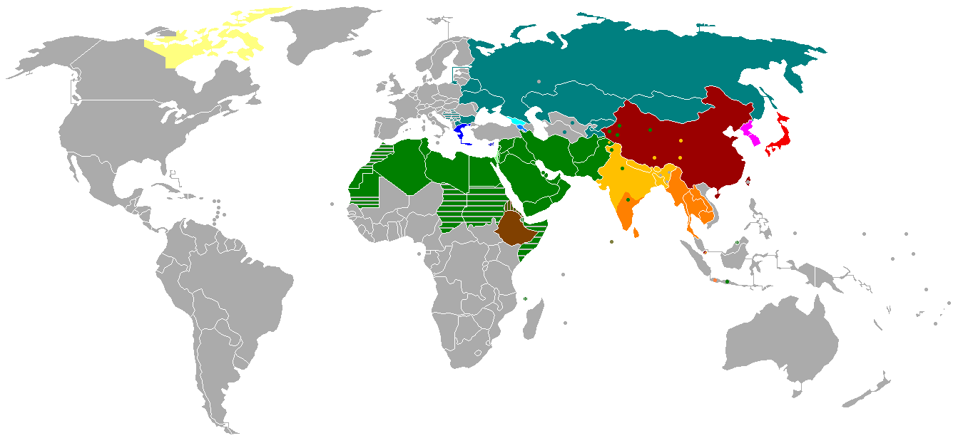
Writing systems worldwide.png

The equivalent to A and alpha in Phoenician is 𐤀, pronounced “aleph.” It has an equivalent in all those other scripts, such as Hebrew א (also called aleph). Okay. But where did aleph come from?

At this point we’re quite far out in the past, with the Proto-Sinaitic script having been in use from the 19th to the 15th centuries BC, so things get a bit murky. But the land of Canaan, where the script was used, is right next to Egypt. And 𐤀 kind of looks like a stylized ox head. So does A, for that matter, except upside down. Look at the math symbol ∀ (“for all”). Pretty easy to see an animal head with horns, right? And so it is commonly accepted that the letter A is descended from the Egyptian hieroglyph 𓃾.9Below, 𐌀 is the Etruscan or old Italic version. I’m not showing Greek Α/α because it would have to go between 𐤀 and 𐌀, but it looks more similar to A than to 𐌀. This is because the actual Greek letter that led to the Etruscan version was an archaic version that is not in Unicode. For more details and more intermediate forms, see Wikipedia on the history of A.

𓃾 → 𐤀 → 𐌀 → A/a

Yes. Each time you use the symbol A or a, which, if you write at all, probably happens dozens or hundreds of times a day, you are in fact using something that ultimately comes from the Ancient Egyptian version of “🐮”.

And all of our letters are like this! (With one exception.) Some are a bit obscure, like B, which apparently comes from the house hieroglyph:

𓉐 → 𐤁 → 𐌁 → B/b

But most others are pretty clear.

𓈖 → 𐤌 → 𐌌 → M/m

𓆓 → 𐤍 → 𐌍 → N/n

𓁹 → 𐤏 → 𐌏 → O/o

(And then, of course, the O became the many-eyed or multiocular O, whose Unicode version is “ꙮ”, in one hilarious and terrifying instance of a monk doodling something in his copy of the Orthodox Christian Bible.)

Here’s the full Latin emoji alphabet based on the hieroglyphic origins of the letters. Hang a version in your toddler’s bedroom, to thoroughly confuse him or her!10You can notice the exception: the letter X comes from Greek Χχ (chi), but chi was apparently a native Greek invention and wasn’t derived from Phoenician or Egyptian hieroglyphs. So I left it as is.

🐮🏠🏒🐠🤷🥄🏒🚧💪💪🤚🦯🌊🐍👁👄🐒🗣️🏹❌🥄🥄🥄X🥄🥢

𓃾𓉐𓌙𓆛𓀠𓌉𓌙𓊐𓂝𓂝𓂧𓋿𓈖𓆓𓁹𓂋𓃻𓁶𓌓𓏴𓌉𓌉𓌉X𓌉𓏭

ABCDEFGHIJKLMNOPQRSTUVWXYZ

Maybe next time I’ll create an extension to turn all Latin letters into hieroglyphs or emoji. Just to confuse everyone.

To conclude, emoji aren’t a return to anything. We’re still using symbols based on real objects, even if most of them aren’t recognizable anymore. Our system is a bit more advanced than the Egyptians’ — for one thing, we have vowels, they didn’t — but it isn’t fundamentally any different.

Of course, emoji do fulfill some needs — otherwise we wouldn’t use them. They are recognizable as objects and ideas, unlike our letters. They’re diverse. They’re fun. Maybe a good, complete writing system should feature small pictures to convey emotion, nuance, and humor. In a way, the Egyptians had a bit of that. Now we do too, thanks to emoji.

I would say it is a good development.

✨ Download the Emoji to Hieroglyphs extension here ✨

Categories
essay

In Defence of Parentheses (and Footnotes)

A hierarchy of methods to add extra detail to a sentence, from “the info is super duper important” to “I kind of want to mention it but it’s definitely far from essential”:

1. No punctuation

If there’s no punctuation, a piece of information becomes integral to the sentence and seems important. Without it, we’d be missing something key. Consider:

The top hat-wearing President arrived at high noon.

We could remove “top hat-wearing,” but the picture created in your mind would be very different; it would even feel like we’re talking about another President.1For the sake of completeness, here’s an extra level, called level 0, which probably should have gone first. But it belongs outside the hierarchy, in my opinion. So now you get to read level 0 in this awkward spot between levels 1 and 2.

0. Separate clauses or sentences

When two pieces of information are separated by something like a semicolon or period, they’re given equality; neither is more important than the other. Consider:

“The President arrived at high noon; he was wearing a top hat.”

“The President arrived at high noon. He was wearing a top hat.”

Here, the arrival of the President isn’t more important than the top hat. The rest of the list, below, assumes that isn’t true. The top hat is just added detail to the main idea of the President arriving at noon.

2. Commas

Commas serve many purposes, but one of them is to break the flow of a sentence to add extra info. The break, however, is minimal. Commas are subtle, like a short breath.

The President, wearing a top hat, arrived at high noon.

Compared to the previous example, the top hat has been relegated to the status of important but not essential detail.

3. Em-dashes

Em-dashes2which by the way are the symbol “—”, not “–” and certainly not “-” or, God Most High forbid, “–“ 3hey, another digression: did you know the “em” in “em-dash” stands for the letter M, representing the size of the dash? Unlike what some poor souls mistakenly believe, it doesn’t mean “emphasis dash”. are sort of a middle ground between commas and parentheses, and can replace either. They’re striking, but also make it obvious the info is outside the normal flow of the sentence.

The President — who was wearing a top hat — arrived at high noon.

Wow! A top hat! So striking! We could do without it — it’s clearly identified as extra detail — but the em-dashes draw attention to it. Use em-dashes if you want the reader to actually notice.

4. Parentheses

Parentheses have a similar effect but are more delicate. While the em-dash is crashing the party and getting everyone’s attention, the parenthesis is instead just lounging quietly in a corner, happy to talk to you if you want, but making no special effort to come to you.

As a friend of mine puts it, parentheses are like a mid-sentence whisper.

The President (donning his famous top hat) arrived at high noon.

A parenthetical statement is like a thread running in parallel, a branch leaving the main sentence and rejoining it later. It gives the writing a more complex structure, which of course can be either good or bad.

5. Footnotes

Ah, the footnote.4Also called endnote if it’s at the end of a book. A little asterisk, or number, or other symbol, timidly tugging at your sleeve and saying, “Hey, there’s some other info I can give you on this, but it’s kind of outside the scope of this sentence. Read it only if you truly want to… Actually, forget I said anything. It’s not that interesting anyway. If it were interesting, it’d be included in the main text with any of the above four methods, am I right? Haha, bye!”

The President arrived at high noon.5Intriguingly for an elected head of state in the 21st century, the President was wearing a top hat.

Did you click the footnote? Did you feel compelled to? Or did you just feel like ignoring it, dismissing it as irrelevant information?

If you did click it, you may have noticed it was longer than the top hat info in the other examples. Footnotes give a writer more freedom. In fact, the lower we are in this hierarchy, the more freedom the writer has, because the farthest we are from the main sentence. But then the reader also has more freedom — freedom to ignore the piece of information.


Is it worth using the bottom of the hierarchy, parentheses and footnotes, at all?

These methods clearly indicate that a piece of information is less important. According to style guides, the reader should be allowed to skip them without changing their understanding of the text. So the writer might as well just skip them too. Right?

As always, the answer is “it depends.”

It depends on the genre, for one thing. If you’re copywriting, you really just want to show the key info, and show it in big bold letters. No room for parentheses or footnotes.6Or so I assume; I’m not a copywriter. If you’re writing fiction, digressions are likely to detract too much from the story, as you know if you’ve read a scholarly edition of something like The Odyssey that is full of endnotes to tell you that translators don’t agree on how to translate οἶνοψ πόντος exactly.7It is usually translated as wine-dark sea, if you must know. Of course, some fiction writers use them anyway. Notoriously, the novel Infinite Jest includes “388 endnotes, some with footnotes of their own.”

What you’re reading right now belongs to the age-old genre of “informal blog post with some microhumor,” for which parentheses and footnotes work very well. At least so I think. Obviously, whether a writer should use them also depends enormously on their writing style. They’re an extra color in the writer’s palette; another tool in the toolbox. You may or may not want to use them.

As the astute reader will have noticed, parentheses and footnotes tend to show up quite a lot in my own writing.8I am going a little overboard with this essay, but I that’s on purpose. I really like them. I think they’re a super useful tool. So I even installed a WordPress plugin to make it easy to include and read footnotes, like this.9I don’t actually have anything to say in this footnote. Have a bright, wonderful day!

(I also sometimes put entire paragraphs between parentheses. Like this. An entire paragraph! This is kind of a middle ground between a simple parenthetical phrase or sentence, and a full-fledged footnote. I love these paragraphs, whether they’re mine or other writers’.)

The reason I use parentheses and footnotes aplenty is that I really like them as a reader, too.

Not everyone does, though. Some readers don’t like parentheses and actually — the nerve! — quickly skim their contents until they get to the closing bracket. Style guides will warn you of this. They always tell you to use parentheses “sparingly.” Or even avoid them altogether (source):

Because they are so jarring to the reader, parentheses should be avoided whenever possible.

If removing a parenthetical note changes the meaning of the sentence, it should not be in parentheses.

Or (source):

Some of us love to use parentheses. Unfortunately, some readers ignore anything that appears in parentheses, so don’t put important information in parentheses if you can help it.

Even those who do use parentheses and footnotes, and use them well, can feel guilty about it. Here’s Scott Alexander, in an essay about nonfiction writing advice:

I agonize a lot about where it is versus isn’t appropriate to break the flow of ideas. Sometimes I use the really ugly solution of having an entire paragraph within parentheses, as if to say “I really wanted to bring this up here, but remember it’s not actually part of the structure of this argument!”

(this is a good meta-level example. I used the word “actually” there, and I wanted to point it out as an example of what I was talking about before, but doing that would break the flow of this whole argument about how you shouldn’t break the flow of things. So, in accordance with the prophecy, into a paragraph-long set of parentheses it goes. I’m starting to think maybe I’m not the best person to be giving writing advice…)

Scott writes amazingly and definitely is one of the best people to give advice. In fact, I feel a twinge of excitement whenever I get to a parenthetical paragraph in one of his essays. Where other people may think “hey, this is irrelevant, I’ll just skip,” I think “huh, this is outside the normal flow of ideas, but he still chose to include it… Must be extra interesting!”

This is the core idea of this essay so I’ll make it bold: Parentheses and footnotes are fun because they are acknowledged digressions.

A lot of the fun in life comes from digressions — of stepping outside the bounds of the ordinary, of skipping class to go on an adventure, of following a Wikipedia rabbit hole instead of finishing the article you were reading. Of course, digressions can also be distractions. But when they are acknowledged with punctuation signs, we, as readers, are warned. We are free to either skip it, or dive straight into this part that the writer thought was so good he couldn’t bring himself to take it out.

Think about it: writers are always encouraged to cut out the boring parts. They’re also encouraged to cut out parenthetical statements, as the styling guides say. So, to survive, a parenthetical statement should be the opposite of boring; otherwise the selective pressure against them would be too strong.

(Or, well, it should be. Not all writing is good, and boring digressions happen just as superfluous adverbs and stale metaphors do.)

Also, as I mentioned earlier, the inherently skippable nature of acknowledged digressions means that the writer gets more freedom. More freedom tends to mean more risk-taking. And more risk-taking, in writing as elsewhere, often means better rewards.

Footnotes, especially, allow a writer to experiment. What’s the worst that can happen? That the reader just goes back to the body of the text? That’s… perfectly fine, right? So, have fun: Write in a totally different style.10Indeed, one of the crucial sources of enjoyment in the consumption of literate material is so-called “code-switching” between linguistic registers ranging from the familiar or, even, the vulgar, to the formal. It is commonly believed that a single piece of written work should utilize a single type of phraseology; yet the juxtaposition of words pertaining to greatly differing registers may augment the vitality of the discourse to such an extent that readers may become elated. Add colors, different fonts, emoji.11🌈 color sometimes looks unserious but it can be so much fun! 🌈 Include super technical detail.12My footnote plugin is called Modern Footnotes. To insert a footnote, I add the tags [ mfn ] and  [ /mfn ] (without spaces) to the text of my essay in WordPress. Attempt to be funny.

That last one is important. Being funny is a great quality to have in most writing, but it’s risky business — a joke always has a chance of falling flat. It’s not easy to write comedy or, as I try to do, microhumor;13What is microhumor? It is tiny dashes of writing that will not make the reader laugh, exactly, but will bring a smile to his or her beautiful face. It can be done in many ways: exaggeration, hedge words, unusual juxtaposition, etc. I subscribe to Scott Alexander’s view that microhumor is “maybe the number one thing that separates really enjoyable writers from people who are technically proficient but still a chore to read.” but I do find it easier to write it in footnotes, for some reason. Now I realize what the reason is: it’s the freedom. (So don’t skip my footnotes. My best bits of writings are often hidden there!)14This parenthetical sentence used to be a footnote, but then I realized that people who don’t click footnotes are its intended audience, so there.


As an example, consider these footnotes from Shea Serrano’s Conference Room, Five Minutes: Ten Illustrated Essays About The Office:

Now these aren’t that funny in isolation, and I’m not going to  copy-past the entire page (sorry), but I really like Footnote #9: “LOL.”

Another writer who does digressions well is Tim Urban from Wait But Why. Tim is a master at this. He has two types of footnotes: gray squares for boring ones, such as citations, and blue circles for interesting stuff that didn’t make it into the body of the essay. This distinction is an excellent way to reinforce the positive signal on the fun footnotes.

Tim also invented a custom sixth level to the digression hierarchy: the blue box. Which can be nested through the use of the bluer box. Here’s a screenshot from his post about AI:

Masterful.

Writers can get even more creative than that. Online, especially, there’s no shortage of devices you can use to structure a piece of writing. Julian Shapiro, for instance, has collapsible sections in his guides, for instance this one on writing first drafts. They’re collapsed by default, thus working similarly to footnotes.

Of course, you can also just add information by providing a link. Or you could embed a YouTube video. At this point, however, we’re leaving the world of pure writing and entering the wider world of multimedia content.

Scott Alexander, in the writing advice essay I quoted above, suggests that it’s good to break the flow of the writing to provide variety. You can do this in many ways — bold, italics, images, links, quotations.15By contrast with parentheses and footnotes, I don’t actually like to read quotations that much, and I will often skim them. I think it’s because unless the author is self-quoting, they tend to be written in a different style from the author’s, and quite often less to my taste. After all, I selected the writer I’m reading, but had no say in selecting the author of the quote. (Yes, I’m aware that I used them several times in this essay. They are useful for a writer. In my defence, Scott Alexander writes better than I do.) Parentheses, footnotes, and Tim Urban’s blue boxes are simply extra tools for this purpose. Extra colors on the palette.

Don’t use them if you don’t like them. Don’t read them if you prefer not to. But remember that they can be, for readers and writers alike, a lot of fun.


Thanks to Rishi, Alicia, Kritika, Kushaan and Tamara for the original idea and comments on the first draft.