X
Categories
original research

Of Emoji and Hieroglyphs

Emoji are pictograms that are used to add nuance and meaning to electronic written text. They were invented in Japan in the 1990s and are now widely used across the world. Random examples: 🤾‍♂️ 😒 🦑 🔊 💚

Egyptian hieroglyphs are characters, mostly based on real objects, that were used to write the Ancient Egyptian language. They were invented around the 32nd century BC and fell into disuse by Late Antiquity. Random examples:1If you only see squares, that means you need to install a font that supports those Unicode characters. Most browsers will display them automatically, but I’m not sure about the details. 𓊛 𓋊 𓃕 𓌗 𓎁

There’s an obvious parallel to be drawn between the two, which multiple people have pointed out, usually with cries of “Thousands of years of language evolution and we’re back to using pictograms!” Even I tweeted about a few months ago:

As Twitter threads go, this was a reasonably popular one, which means there was some value in investigating the links between emoji and hieroglyphs. But maybe not enough to write more than a few tweets, and so the matter was put to rest.

Then I read Clo’s excellent piece on emoji and our relationship with them, and it made me want to revisit the topic. So I embarked on a small and silly side project.

The result is being released today. It is a browser extension. It is called Emoji to Hieroglyphs. It replaces the former with the latter whenever possible as you browse the web. It’s stupid and fun. And it can be downloaded here.

How it works

Emoji to Hieroglyphs is based on the famous cloud-to-butt extension — which replaces “the cloud” with “your butt” all over the internet — because I don’t really know any JavaScript so it was simpler to steal code from somewhere. Good thing that cloud-to-butt is released under the “Do What The F*ck You Want To Public License”, which I’m also using for Emoji to Hieroglyphs.

The extension searches text in web pages for certain emoji, and replaces them with the closest hieroglyphic visual equivalent I could find. Here are some examples:

🤸 → 𓀡

✍️ → 𓃈

🐇 → 𓃹

⛵ → 𓊝

(Of course, the extension needs to be uninstalled for these examples to make sense.)

Not all emoji have a hieroglyphic equivalent. As of today, there are 3,521 emoji in Unicode 13.1, but only 1,071 hieroglyphs. A lot of the extra emoji are things that didn’t exist in Ancient Egypt, such as soccer ⚽, helicopters 🚁, Japan 🗾, or jack-o-lanterns 🎃. Many others represent something that did exist along the banks of the Nile, but that the Egyptians didn’t bother making a hieroglyph for, e.g. skulls 💀, grapes 🍇, or crabs 🦀. I assume the Ancient Egyptians had emotions, but there aren’t any hieroglyphs to represent them directly, so smileys such as 😄, 😍, 🤯, or 🤑 are also not affected by my extension.

Not all hieroglyphs have an emoji equivalent, either. Many are just too abstract, like 𓊖, which is supposed to mean “village.” Several others are combinations, like 𓆲, combining an owl and a branch; I could’ve used it to replace 🪵🦉 and 🦉🪵, and indeed I did this for a few combos, but usually that’s just not very interesting. A few hieroglyphs represent things that the Unicode Consortium has prudishly decided not to depict as emoji, such as breasts or phalluses.2Ancient Egyptian has three hieroglyphs for the penis: 𓂸, 𓂹 (phallus combined with cloth), and 𓂺 (phallus with emission). I considered replacing the eggplant emoji 🍆 with 𓂸, but then I decided it’d be confusing and offensive for people using it as, uh, an actual eggplant. And a lot are just too specific to Ancient Egypt. For instance, there are regrettably not yet emoji for “pyramid,”3although I used it to replace the Tokyo Tower emoji 🗼, because why not “mummy-shaped god,” “crocodile on shrine,” or “human-headed bird with bowl with smoke.”

𓉴 𓁰 𓆋 𓅽

Maybe in Unicode 14.

I did manage to create more than 300 mappings, not counting all the skin tone and gender emoji variations, which I have for the most part merged together. Everyone is an Egyptian in my extension! Also, almost everyone is male, because there are only a few specifically female hieroglyphs, usually related to pregnancy or child rearing. Don’t blame me, blame the Ancients.

The most affected emoji categories are people (except smileys), animals, plants, and a bunch of random objects such as containers or bread-like foods.

Here’s a screenshot from Emojipedia’s list of people emoji, modified with the extension:

I should note that I created mappings only based on the visual appearance of the symbols. The word “doctor” in Ancient Egyptian is written with three glyphs, 𓌕𓏌𓀃,4The arrow should be above the pot, but I can’t do that in linear text. but I didn’t map the emoji 🧑‍⚕️ to that combination since it wouldn’t be very evocative. Such a mapping would be more akin to a translation, which isn’t the goal here.

On the other hand, not all visual mappings are as obvious as 🐘 to 𓃰. Consider 𓆳, which is supposed to be a palm branch. Since there is no palm tree hieroglyph, I used the palm branch to replace the palm tree emoji.

🌴 → 𓆳

The link may not be crystal clear to users, but I included it anyway in the interest of having as many mappings as possible. Here are a few other examples where the emoji and hieroglyphs do represent the same object, but where the resemblance isn’t that strong:

🔥 → 𓊮

🏠 → 𓉐

💩 → 𓄽

Conversely, some mappings are just based on superficial resemblance. The sistrum is an ancient percussion instrument which, as you can imagine, doesn’t have a close emoji equivalent. But since it’s about music and sort of resembles a microphone, that’s what I decided to use it for. There are also “woman holding sistrum” and “man holding sistrum” hieroglyphs, so it made sense to replace the female and male singer emoji with those.

🎤 → 𓏣

👩‍🎤 → 𓁙

👨‍🎤 → 𓁋

Finally, not all mappings are 1:1. Sometimes multiple emoji together make a single hieroglyph.

🌊 → 𓈖

🌊🌊🌊 → 𓈗

And sometimes a single emoji is expressed through multiple hieroglyphs.

🏡 → 𓆭𓉐

👀 → 𓁹𓁹

There are a few combinations that could be considered Easter eggs. I will not tell you which.

Overall, don’t expect a lot of consistency. This is obviously just for fun, and I hope some of you do have fun with it. I had fun making it; I even learned a few things! Which we’ll get into presently.

Some linguistics

To some, emoji mark a return to a more primitive form of language. We started out with cave paintings, then we developed pictograms (character = picture), then we got more general logograms (character = word), and then we gradually invented more symbolic forms of writing, culminating in clean5alphabets aren’t actually clean, they’re super redundant and inconsistent, but let’s allow this for the sake of the argument phonetic alphabets with a few dozen characters.6At least in the West. Chinese has remained at the logogram stage, and there aren’t any strong reasons to think it’s inferior to alphabetic writing. This should make us dubious of claims that the evolution of written language has followed any sort of natural progress. And now, with the advent of mind-numbing technology such as smartphones and Twitter, we’re apparently back to pictograms.

Thus joke images such as:

and:

and:

(Two notes about this last image: first, those mappings are terrible, and second, the image on the left isn’t even a picture of actual hieroglyphs. There isn’t a hieroglyph that looks like “#”. I don’t know where it’s from, but it’s very fake.)

Many media pieces discuss the question, and they all converge on the same point: No, emoji and hieroglyphs are not the same thing. Hieroglyphs weren’t just cute drawings to decorate Egyptian temples! They were a full-fledged writing system! A single hieroglyph, say the wigeon duck, 𓅰, could be used to represent an actual wigeon, yes, but it could also represent the idea of food, or the verb “to fatten,” and it had full phonetic value just like our letters, being used to transcribe the consonant sounds wšꜣ!7The symbol “ꜣ”, if you’re curious, represents the conventional transcription of the letter aleph in Egyptology, indicating something like a glottal stop.

Whereas emoji aren’t a writing system. They are mostly cute drawings we use to decorate our sentences. They carry meaning, and are linguistically interesting, but you can’t express arbitrary sentences with them, at least not at the moment.

Perhaps, like hieroglyphs, emoji could one day represent sounds directly. Say 🥶 = “fr”, 😇 = “en”, and 🍩 = “d”. Then 🥶😇🍩 could be used to represent the spoken word “friend,” even though the symbols have mostly nothing to do with friends. Add a ship, 🛳, and now we get a hybrid word, combining phonograms and logograms: 🥶😇🍩🛳, “friendship.” But we’re unlikely to get there, because, well, we already have symbols to represent sounds. The 26 letters of the English version of the Latin alphabet, for example. Or the > 160 symbols of the International Phonetic Alphabet, if you want more comprehensiveness. The reason the Egyptians gave phonetic value to their cute little drawings is that they were all they had.

But I want to go in a somewhat different direction than both the joke images and the serious linguistics articles.

I claim that we never actually stopped using Ancient Egyptian hieroglyphs. I claim that we’re still at the stage of using cute little drawings to represent language.

Consider the letter A, the first in the Latin alphabet. Where does it come from? The Latin alphabet is descended from the Greek one, by way of the Etruscan alphabet. So the letter A comes from the Greek equivalent, Α/α, pronounced “alpha.” But where did alpha come from?

It came from the Phoenician alphabet, whose immediate ancestor is the Proto-Sinaitic script, considered the first alphabet in the world. The Phoenicians were a coastal people of the Levant in Antiquity. Their invention of the alphabet turned out to be quite influential, since the vast majority of the world today writes in systems descended from it: Latin and Greek, but also Cyrillic (used to write Russian, among others), Arabic, Hebrew, Ge’ez (used for Ethiopian), all of the scripts used in India and Southeast Asia, and even Mongolian. In other words, pretty much everything on this map except China, Korea, Japan, possibly Georgia and the syllabary used for indigenous languages in northern Canada.8gray = Latin, teal = Cyrillic, green = Arabic, see the original source for others
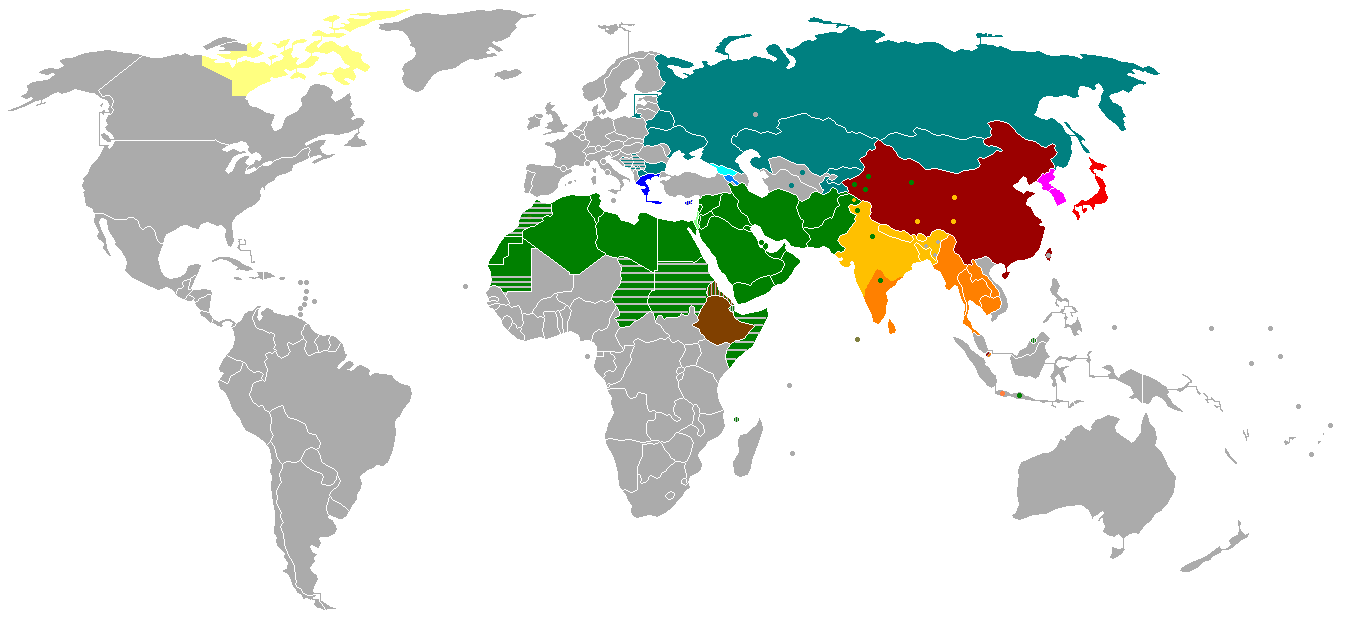
Writing systems worldwide.png

The equivalent to A and alpha in Phoenician is 𐤀, pronounced “aleph.” It has an equivalent in all those other scripts, such as Hebrew א (also called aleph). Okay. But where did aleph come from?

At this point we’re quite far out in the past, with the Proto-Sinaitic script having been in use from the 19th to the 15th centuries BC, so things get a bit murky. But the land of Canaan, where the script was used, is right next to Egypt. And 𐤀 kind of looks like a stylized ox head. So does A, for that matter, except upside down. Look at the math symbol ∀ (“for all”). Pretty easy to see an animal head with horns, right? And so it is commonly accepted that the letter A is descended from the Egyptian hieroglyph 𓃾.9Below, 𐌀 is the Etruscan or old Italic version. I’m not showing Greek Α/α because it would have to go between 𐤀 and 𐌀, but it looks more similar to A than to 𐌀. This is because the actual Greek letter that led to the Etruscan version was an archaic version that is not in Unicode. For more details and more intermediate forms, see Wikipedia on the history of A.

𓃾 → 𐤀 → 𐌀 → A/a

Yes. Each time you use the symbol A or a, which, if you write at all, probably happens dozens or hundreds of times a day, you are in fact using something that ultimately comes from the Ancient Egyptian version of “🐮”.

And all of our letters are like this! (With one exception.) Some are a bit obscure, like B, which apparently comes from the house hieroglyph:

𓉐  𐤁 → 𐌁 → B/b

But most others are pretty clear.

𓈖 → 𐤌 → 𐌌 → M/m

𓆓 → 𐤍 → 𐌍 → N/n

𓁹 → 𐤏 → 𐌏 → O/o

(And then, of course, the O became the many-eyed or multiocular O, whose Unicode version is “ꙮ”, in one hilarious and terrifying instance of a monk doodling something in his copy of the Orthodox Christian Bible.)

Here’s the full Latin emoji alphabet based on the hieroglyphic origins of the letters. Hang a version in your toddler’s bedroom, to thoroughly confuse him or her!10You can notice the exception: the letter X comes from Greek Χχ (chi), but chi was apparently a native Greek invention and wasn’t derived from Phoenician or Egyptian hieroglyphs. So I left it as is.

🐮🏠🏒🐠🤷🥄🏒🚧💪💪🤚🦯🌊🐍👁👄🐒🗣️🏹❌🥄🥄🥄X🥄🥢

𓃾𓉐𓌙𓆛𓀠𓌉𓌙𓊐𓂝𓂝𓂧𓋿𓈖𓆓𓁹𓂋𓃻𓁶𓌓𓏴𓌉𓌉𓌉X𓌉𓏭

ABCDEFGHIJKLMNOPQRSTUVWXYZ

Maybe next time I’ll create an extension to turn all Latin letters into hieroglyphs or emoji. Just to confuse everyone.

To conclude, emoji aren’t a return to anything. We’re still using symbols based on real objects, even if most of them aren’t recognizable anymore. Our system is a bit more advanced than the Egyptians’ — for one thing, we have vowels, they didn’t — but it isn’t fundamentally any different.

Of course, emoji do fulfill some needs — otherwise we wouldn’t use them. They are recognizable as objects and ideas, unlike our letters. They’re diverse. They’re fun. Maybe a good, complete writing system should feature small pictures to convey emotion, nuance, and humor. In a way, the Egyptians had a bit of that. Now we do too, thanks to emoji.

I would say it is a good development.

✨ Download the Emoji to Hieroglyphs extension here ✨

Categories
essay

The Four Shapes of History

History, which contains literally everything that has happened to human civilization, is the data of the social sciences.

If you want to understand virtually anything that’s going on today, whether in politics or the economy or cultural shifts, it’s useful to look at the data. At best, you’ll recognize patterns and make valid predictions. At worst, what is happening today is so new that the data isn’t useful — but to know that, you need to know the data.

There is a complication.

Think about everything that’s happened so far in your life. It would probably be a long story if you were to tell it. Now consider that we’re approaching a population of 8 billion people on Earth. That’s a lot of life events. And now let’s add everyone who’s ever lived. World population used to be far lower, but it’s still estimated that there have been 105 billion human births in the past 50,000 years. 105 billion lives’ worth of data.1To be fair, a lot of those unfortunately died as infants, so they don’t add that many life events to the total. Only a small fraction made it into recorded history, but that’s still a lot.

As The Scholar’s Stage puts it:

The problem with history is that it is too big. It is impossible to get a fine grained picture of every people and era on the planet. There is just too much of it.

So what can we do? Well, there’s no option but to compress. Make a simplified picture of the full dataset. Something that’s easier to handle.

This compression can take any of four basic shapes. To understand them, we first need to look at the two dimensions of history.

The first dimension is depth, or verticality, or time. It describes the changes to any single thing in the world across time.

The second dimension is breadth, or horizontality, or space. It describes the state of the world at any given time point. (This includes the usual three spatial dimensions, but it’s much more comprehensive than that. We’re in fact collapsing the full multidimensional complexity of the world into a single dimension. Moving along this dimension might mean moving across geographical space, but it could also mean moving across conceptual space.)

Thus we can draw the entirety of human history like this:2Where should the chart stop? When does history begin? The traditional definition is that history starts around 3000 BC, when the first civilizations arose, and was preceded with prehistory. But the word ‘history’ is often use in a broader sense, going back e.g. to the appearance of anatomically modern humans 300,000 years ago, or even to the birth of the universe about 13.7 billion years ago. It doesn’t really matter for this post, though. I’ll just go with “the far past.”

When we compress history, we take a slice out of this two-dimensional pie. Slices come in many shapes, but we can classify them into four basic types.

  • a zero-dimensional point, i.e. a single event
  • a 1D vertical line, i.e. across time
  • a 1D horizontal line, i.e. across space
  • a rectangle across both dimensions (or some other 2D shape).

Let’s add a few examples to the chart above:3It was pointed out to me that the invention of writing happened multiple times, yet I put a single point. Very true. Let’s pretend that point is “Invention of writing in Sumeria.”

In practice, all of these are two-dimensional shapes to some extent, just like there can’t be a physical object in our world with a thickness of zero. But compression usually removes most of either the breadth, the depth, or both, leaving us with what is essentially a point or a line. In fact, you need to squint really hard to grasp a full two-dimensional slice of history, as we’ll see below.

Let’s start with the most basic shape: the point.

Zero-dimensional history

A point, in math, is a zero-dimensional object: it has no length in any dimension. Looking at history in a zero-dimensional way means looking at a specific point in space and time. In other words, a single historical moment.

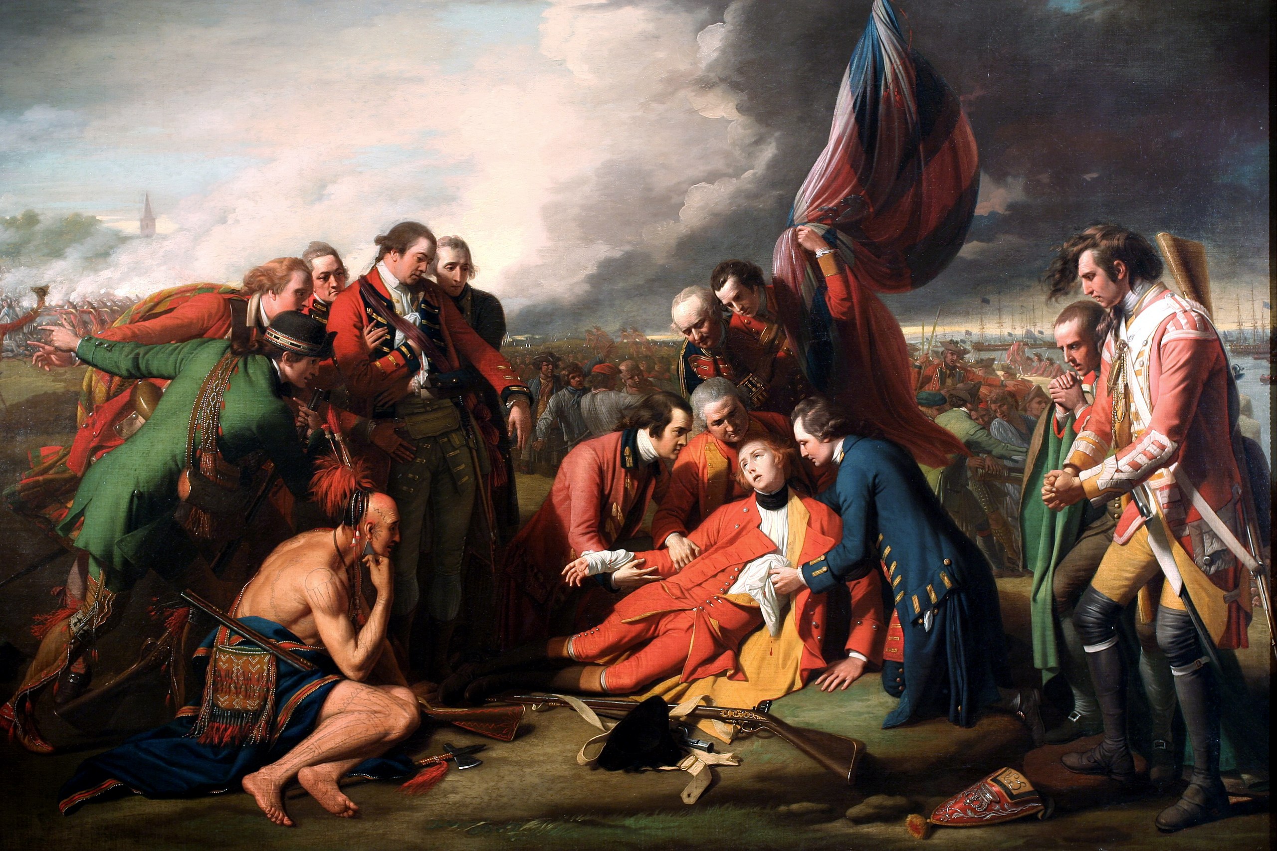
The canonical way to visualize history in 0D is art. For instance, this painting from 1770 by Benjamin West:

Benjamin West 005.jpg

The painting represents the death of General James Wolfe, the commander of a British army that fought at Quebec City in 1759. Wolfe was victorious in battle, but died from gunshot wounds. The painting captures this single moment (although in a semi-mythologized way).

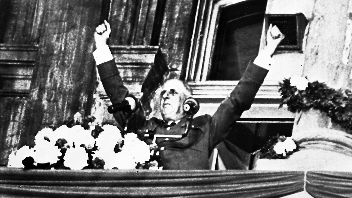
In this age, of course, photography is a more common way to capture a moment. Here is French president Charles de Gaulle addressing a crowd in Montreal in 1967:

n France, though many were sympathetic to the cause of Quebec nationalism, de Gaulle's speech was criticized by much of the media as being a breach of protocol.

Now, unless you have good prior knowledge of Quebec history, those pictures may not have informed you very much. They lack context. And that’s exactly the problem with zero-dimensional history: a true point contains very little data. A single painting can’t capture the full significance of the Battle of the Plains of Abraham, in which the fate of the French colony of Canada was changed forever as it set up its annexation by Britain four years later. A photograph can’t tell the tale of de Gaulle’s unorthodox visit to the province of Quebec during the Quiet Revolution, or the impact his “Vive le Québec libre” exclamation had in a place that was yearning for national recognition and emancipation.

But even if we add a bit of context, we can still effectively (but not strictly) remain in 0D, compared to the full size of history.

Say you’re really interested in the Battle of Vimy Ridge, which pitted Canada, as part of the British Empire, against Germany between April 9 and April 12, 1917. There’s a tiny bit of depth (four days, perhaps more if we’re considering the background and aftermath), and some breadth (you need to know about the general world situation in 1917, such as the fact that the British Empire and Germany were at war). But if you wanted, you could spend years learning all about that battle and only that battle. The preparations, the tactics, the operations, the follow-up events. You would get a very limited view of history as a whole, but that doesn’t matter, if you just care about the Battle of Vimy Ridge.4perhaps, for instance, if you’re a veteran who fought in it

The Battle of Vimy Ridge.jpg

A detailed description of a historical event, just like a painting, a photograph, an artifact, a period film5unless it is epic in scope, spanning multiple locations and periods or anything that remains bounded to a single point in space and time, is a snapshot of history. It can’t, by itself, provide a deep or a broad view.

Which doesn’t mean, of course, that points aren’t useful. They are, especially when we combine them into larger clusters. But then we aren’t in 0D anymore. Depending on whether those points are organized vertically or horizontally, or both, we’ll get either a deep, a broad, or a 2D view of history.

Deep history

Deep history is history viewed across time. That sounds a bit tautological, right? That’s because, usually, deep history is what we implicitly mean when we use the word ‘history’ on its own.

Anything labeled “the history of X” is deep history. By specifying an X, we exclude everything that is not X (unless it is directly relevant to X). If you decide to study the history of Canada, or the history of the fur trade, or the history of the Vachon cake company, then you’re (probably) not going to get into the history of Mesopotamia, space exploration, or the Leclerc cookie company.

Thus breadth is sacrificed. In the interest of building a narrative (it’s no coincidence that history and story are similar words), you take out everything not relevant, and end up with only a small sliver of the entire state of the world at any given time point. Of course, that sliver may contain some breadth, if you’re writing a narrative of something large like “the Americas” or “Western civilization.” But it’s still only a sliver, because your narrative will have to focus on a small part of the Americas or Western civilization at any given point.

Even when telling the story of the whole world, we only get slivers. The history of the entire world, i guess video by Bill Wurtz, arguably the best narrative of human history ever made, does a great job of jumping around to summarize the most significant events of the past 13 billion years, but it just results in an extremely zigzaggy slice of the pie.

Written narratives are the most common way to do deep history, but we can also visualize it.6There are also visual narratives. Time lapses like this one about the history of Manhattan fall into this category. The canonical way is the timeline. Here’s a timeline of Canadian history in the form of a Wikipedia table, for example. Or the Vachon cake company:

This website has a bunch of cool timelines on the history of various appliances:

You can see the lack of breadth easily. This is a good thing, because it allows us to zoom into the interesting stuff, like kettle designs, which are unlikely to be talked about when we make a low-resolution summary of the entire history of the world.

In fact, we can try to create a timeline of the entire world. It might look like this:7This is the most common periodization of world history according to French historians: Antiquity, Middle Ages, Modern Times, and Contemporary Times. With the French Revolution as a cutoff date, it is, yes, very French-centric. Source.

Not terribly informative, is it? Such a timeline pretends to be broad and to cover everything, but it has so little information at any given point that it remains basically one-dimensional. When timelines truly get 2D, they tend not to look like timelines — or, at the very least, they combine multiple timelines together.

Let’s now examine what broad history actually looks like.

Broad history

Broad history is the full state of a relatively large part of the world, or of the entire world, at a fixed time point.

Consider everything that is happening today, which as of writing this is May 8th, 2021. It’s not history yet, because it’s in the present, but it will very soon be in the past. In fact, it already is history as of you reading this, though presumably not very old history (unless somehow this essay ends up being read in the far future).

If you or some far-future historian wonder what the state of the world was on May 8th, 2021, and decide to reconstruct it in some way, then you’re doing broad history. Same thing if I decide to wonder what went down in 1759, or AD 476, or December 16th, 2334 BC.8It turns out 2334 BC is when Sargon of Akkad started conquering Mesopotamia, though the clay tablets do not say if that was in December.

Broad history is very much non-narrative, which is why, I think, it’s a somewhat less common approach than deep history. Humans like stories. They’re one of the major ways we make sense of the world. To do broad history, instead, we need to deal with a lot of simultaneous data, without (or with very little) time being involved. Our brains aren’t great at this task.

Also, especially for pre-modern times, the data in various parts of the world are often so uncorrelated that there’s rarely any point to studying them at the same time. The most extreme example of this is probably the separation of the Old World (Eurasia & Africa) and the New World (the Americas). A narrative set in either is likely to completely ignore the other (until the point when they established permanent contact, of course).

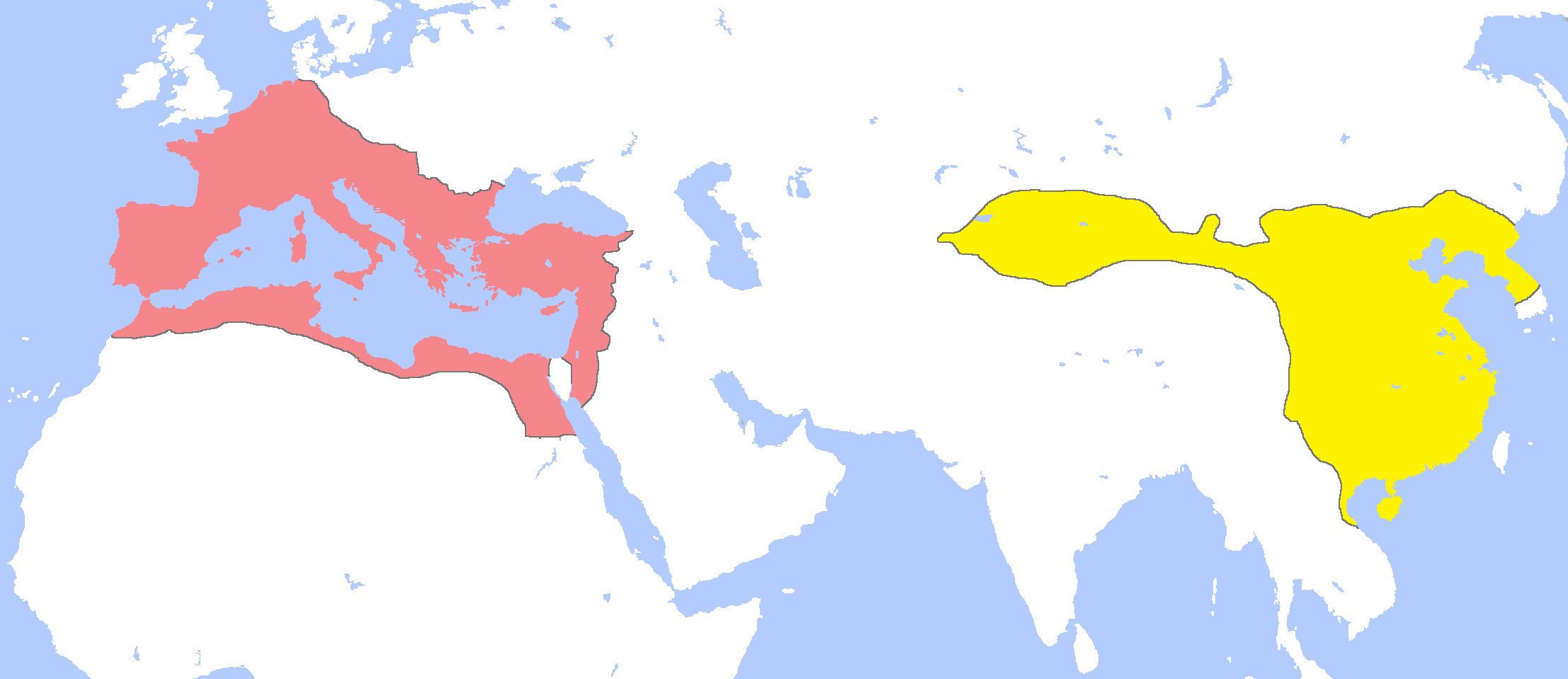
There are countless less extreme examples. For instance, did you know both the Roman and the Han Chinese Empire were going strong in 1 AD, and that there’s a whole field of historical studies about their indirect relations?

Or that J.R.R. Tolkien, Adolf Hitler, and Anne Frank’s father participated in the same World War I battle in 1916?

Those facts are surprising because they join together what we usually think of as distinct narratives. The rise to power of Hitler has little to do with Tolkien’s life and writing career. The story of how the Romans founded a republic that conquered the Mediterranean and became an empire has little to do with the unification of China under the Qin dynasty and its transition to the Han dynasty.

Put another way: There’s a Wikipedia list of Roman emperors. There’s a Wikipedia list of Chinese emperors. But there’s no Wikipedia list of emperors and leaders in AD 1.

The best we have is a list of events, births and deaths for every year (and decade, and century). Here’s 1 AD, for instance. This is a form of broad history. Another form is to write a long, detailed description of the world at some time point, for instance a book titled “The State of the World in 2021” or some such.

But broad history, unlike deep history, is best studied visually. And the canonical way to do that is the historical map. The map with China and Rome above is an example. Here’s a more complete one for the same year, AD 1, from Wikipedia’s cool collection of historical maps of the Eastern hemisphere by Thomas Lessman:

Another version, now covering the whole world:9source

GeaCron’s Interactive World History Atlas since 3000 BC is a great resource to look at the world map of any specific year in the past five millennia. AD 1 again:

Of course, such maps have low resolution. They give an overview of the state of the world, but no details of what was going on in Rome or China or among the Arctic Marine Mammal Hunters up in Siberia. Textual descriptions can do better, but in general, it’s hard to get information of this kind with broad history. 0D and deep history might be better approaches.

Or we can just go the opposite way and start stacking our broad historical maps over the temporal dimension, and see history in its majestic two-dimensional glory.

Two-dimensional history

You know how it’s always awkward to display a 3D object in a 2D space? For instance, here’s a cube:

Hexahedron.svg

This isn’t actually a cube. You’re (probably) reading this on a screen in 2D. So what you see is the 2D projection of a cube, which your brain converts to a 3D object in your imagination.

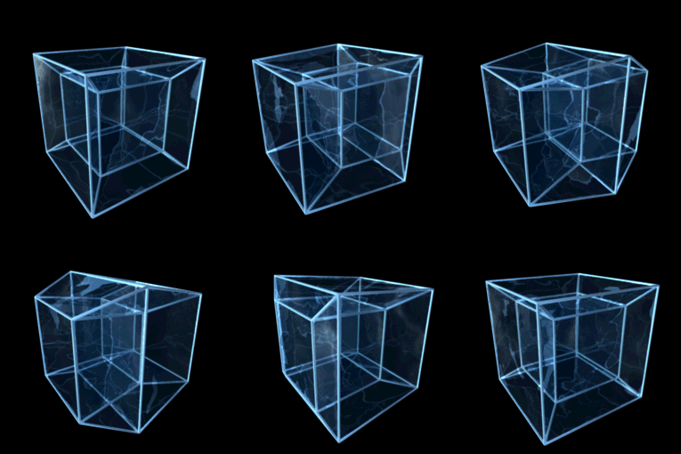
Your brain can do that because it’s used to 3D space. But consider a 4D hypercube, a.k.a. a tesseract. This isn’t something we can imagine well. The best we can do is project it in 3D or 2D. Here’s what it looks like when a 4D hypercube is projected onto a 2D screen:10source

Hypercube.svg

We can do slightly better if we add time as a third dimension:

You can sort of see the hypercube with this gif, if you squint really hard and let go of your preconceptions about the physical world. But you can’t really make a good mental image of a 4D object, in its full detail, because that’s not a thing human brains do.

History across both breadth and depth is the same deal. You can never quite grasp its full depth and breadth. But you can sort of see it if you project it cleverly and squint really hard.

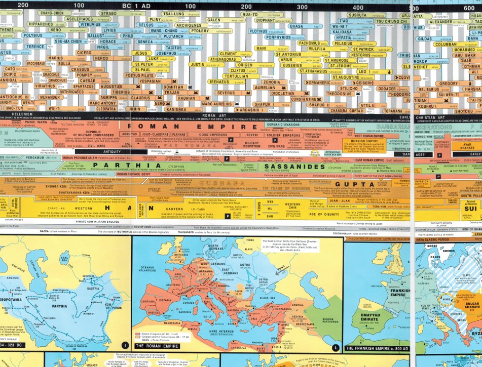
The canonical way to do that is the kind of super complicated chart that combines multiple timelines and maps. Like this:11by Andreas Nothiger. Full chart here

Image

Or the Histomap, created by John B. Sparks in 1931 (it may take a while to scroll down)12Found here; click the image for full size.:

histomap big version

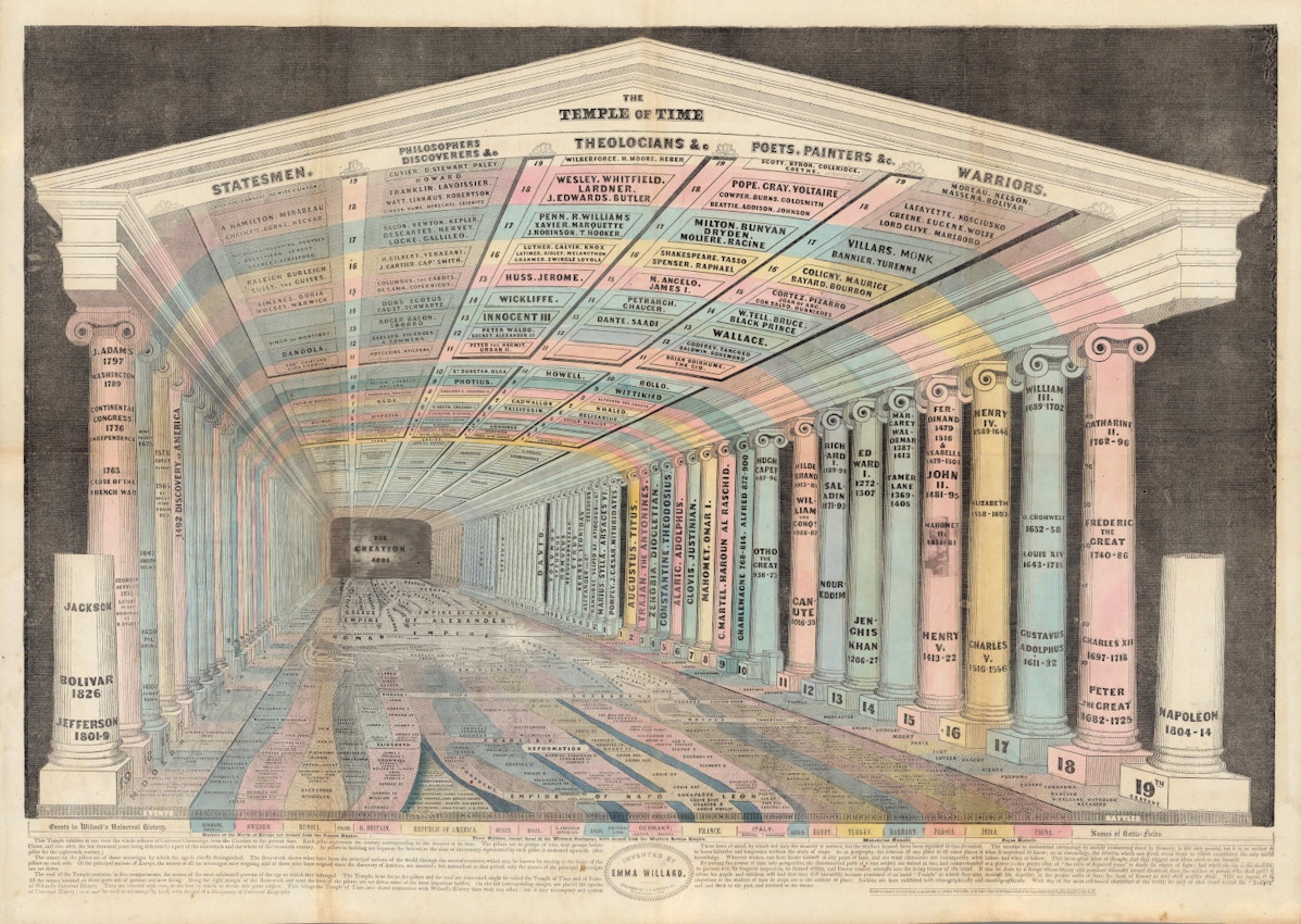
Or the incredible Temple of Time by Emma Willard (drawn in 1846):

Temple of Time Emma Willard

(See this Twitter thread for some other examples.)

I find those pictures impressive. They are masterful attempts at compressing all of history in the least lossy way possible. But you immediately see the limitations. They’re hard to read. They take a lot of space. They involve a lot of choices as to what information should be included.

A good example of the dilemma of inclusion is Tim Urban’s Horizontal History post on the blog Wait But Why. (Despite the title, it’s 2D history, not broad history.) Tim’s large charts contain famous people’s birth and death years, and little else. They’re great! We rarely see the data displayed like this. But everyone will agree that the post merely scratches the surface of the history at any given time or place. Important people are just a tiny part of the whole story.

Also, all of the above are static visualizations. What if we used time directly to add an extra dimension?

Go back to GeaCron, pick an arbitrary year (say, 1867), and then just click on the back or forward arrows repeatedly. You’ll be able to see how the political map of the world change across time, and sort of get a grasp of history in its full breadth and depth.

Of course, you might just as well look at a time lapse instead of clicking repeatedly. There are many such videos. Here’s a 19-minute one:

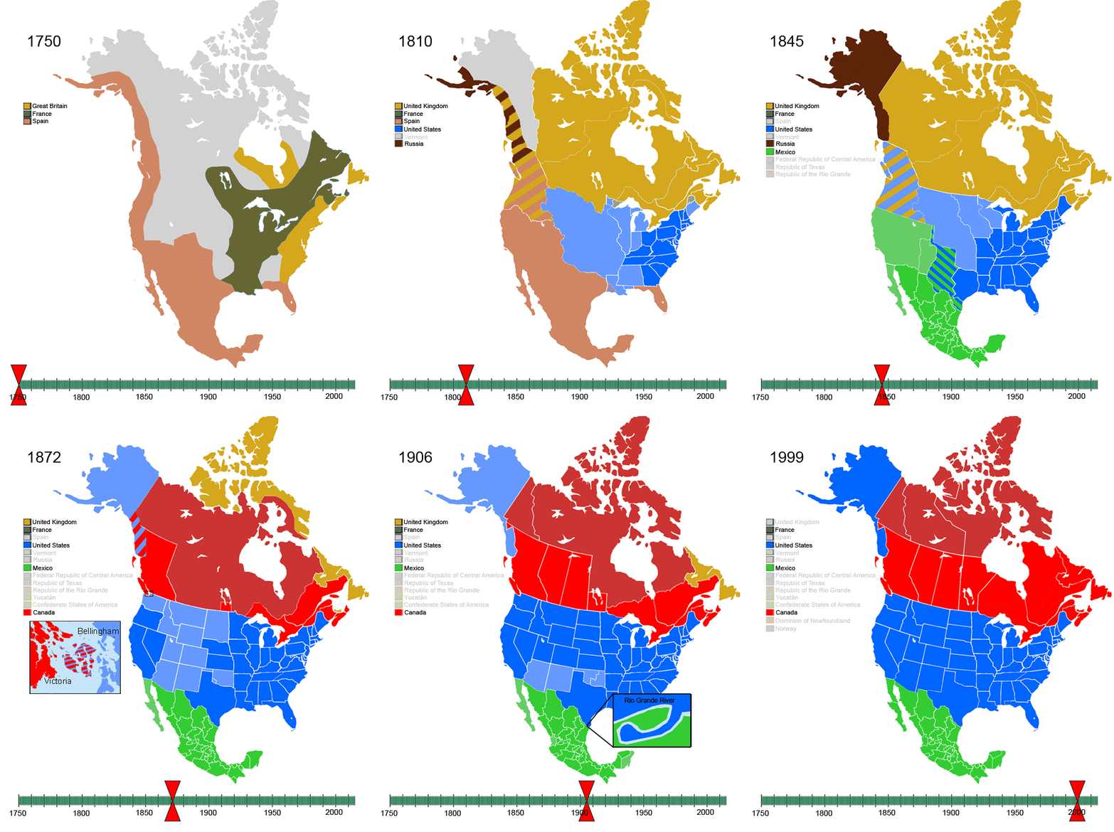
Here’s another, covering less breadth and depth, since it focusses on the colonial and post-colonial states of North America after 1750. But it’s still definitely 2D.13source

Non-Native-American-Nations-Territorial-Claims-over-NAFTA-countries-1750-2008.gif

As we saw in the broad history section, maps, fun as they are, give us only a high-level overview. What if we could zoom into the map and examine the daily life of the women and men at any point in space and time? What if we could do this without sacrificing depth and breadth to get back to 0D history?

Now we’re entering the realm of detailed historical simulations. Those are extremely difficult to build, considering the enormous amount of data required. I’m not sure that a good, accurate, detailed simulator of world history exists, or ever will.

Fortunately, there’s an entire industry devoted to the creation of high-quality simulations, although it does so at the expense of accuracy: video games.

Specifically, grand strategy 4X14a subgenre of games that involves eXploring, eXpanding, eXploiting, and eXterminating games, of which the most prominent examples, and the ones I’m most familiar with, are the games in the Civilization series. Other examples include Age of Empire and pretty much anything by Paradox Interactive, like Europa Universalis or Crusader Kings.15Disclaimer: I’ve played zero to very little of any of those games except Civilization II to V.

(Any game with a relatively accurate historical setting can also be used as a simulation. I once saw an exhibition about Ancient Egypt, and the museum had partnered with Ubisoft to provide visitors with a special educational version of Assassin’s Creed Origins. You could explore the city of Alexandria as it might have appeared in the time of Queen Cleopatra VII, around 49-43 BC. Pretty cool! However, there wasn’t much breadth and even less depth; it was much closer to 0D than 2D.)

The people making and playing grand strategy games tend to be careful about claiming that they’re a good way to learn history. You can see why: they’re often wildly inaccurate. In a typical game of Civilization, you’ll have a randomly-generated map in which the Roman Empire coexists with the United States of America, the Aztec Triple Alliance, and the Mongol Empire in 2500 BC. In Europa Universalis IV, you can end up with such sights as this:16source

The reason games tend to be historically inaccurate is that they optimize for gameplay and fun. As interactive media, they must give players freedom, which necessarily means freedom to diverge from actual history. As a result, a lot of the details will simply be wrong.

But games can still be useful in two ways. The first way is to give the spark of curiosity. After playing the Byzantine Empire, you might get curious about this civilization, wonder why you never learned about it in school, and go binge-read Wikipedia about it.

The second way is to give a better understanding of the concepts and forces that drive history. For instance, most 4X games involve a technological tree. As the game progresses, your country develops new technologies; at some point, you learn how to build ocean-going ships; you send your new ships out and find a new continent; you meet faraway civilizations and have to decide whether to conquer or ally with them. Even if the specifics are inaccurate (say, you’re playing the Zulus and conquer Russia), role-playing the part of a conquistador civilization can help you grasp reality with more clarity. Being the Kingdom of Spain and conquering the Inca Empire is a fuller experience than reading about the conquest or looking at changes in the map of South America.

I credit a lot of my understanding of history to a heavily modified version of Civilization IV called Dawn of Civilization. This mod, which is still undergoing active development17including by myself, with a few very modest contributions sixteen years after the base game came out, tries to follow real history as much as possible without sacrificing gameplay. It’s played on a reasonably accurate real-world map, and civilizations arise (and fall) at approximately correct dates.

Any single game of Dawn of Civilization diverges from reality, especially the parts that are affected by the player’s actions. But the computer-controlled civilizations are programmed to act historically, and the overall narrative tends to follow real history fairly well. Which means it’s actually useful to get a 2D view.

For instance, you could be playing as China and spend all your time dealing with the northern barbarians and the Mongols and the Koreans while having no idea what’s going on on the other side of the world. Then you get ocean-going ships and reach Europe and the Mediterranean… at which point you realize these places have been doing their own thing for centuries. Wars, collapses, religions you knew nothing about.

(And you might see a rare occurrence, such as the civilization of Carthage in North Africa surviving until the 18th century:)

The simulation simulates everything, even if it’s not relevant to your immediate game experience. But of course, you never know what is relevant. Maybe you decide to play the Ottoman Turks. But unbeknownst to you, a stronger Persian Empire in this particular game thwarted the spread of Islam by the Arabian Caliphate, centuries before you start your game, and that’s why you end up playing a Christian Orthodox Ottoman civilization.

The 2D view of history you get from a computer game isn’t accurate, but I know of no better way to viscerally feel, as opposed to read or watch, the forces that underlie human affairs. Plus, games have the benefit of being, you know, fun to play. You’re never going to learn any history if you don’t find it fun.

*

None of the four basic shapes of history is better than any of the others. Like in any complex field, the only way to gain a good understanding of the whole thing is to spend a lot of time studying it. But you can be smart about that, and study history in a variety of ways.

Art and photography give you a snapshot of a time and place, a detailed idea of what it would have been like to be there.

Narratives and timelines make history coherent and interesting by hijacking our love of stories.

Maps provide a large-scale overview of an entire period, joining together distinct narratives.

And complicated 2D projections, as well as simulations and games, create this awe-inspiring impression of seeing all of history at once, even if we know the picture will always be too much for our feeble brains.

Get enough of each, and you will understand the data of the world.


Thanks to Sachin Maini, Alicia Kenworthy, Kritika Sony, Rishi Dhanaraj, and Kushaan Shah for readings drafts of this piece.